
Digital designers used to face a brutal binary choice regarding imagery. You either hired an illustrator to build a custom brand system-expensive and slow-or you scavenged stock sites. The latter usually resulted in a “Frankenstein” UI. Hero images looked like watercolor paintings while contact icons resembled technical clip art.
Ouch, a vector illustration library by Icons8, bridges that gap. It positions itself not as a repository of images, but as a collection of style systems. The central question for product teams is simple: Can an off-the-shelf library support a coherent brand identity, or is custom illustration the only path to professional polish?
The Architecture of Style Systems
Ouch organizes assets differently than its competitors. Most stock sites sort by subject-dogs, business meetings, servers. Ouch sorts by style.
With over 100 styles ranging from “Surrealism” to “Simple Line,” the platform prioritizes depth over breadth. If you choose a specific 3D style for your onboarding flow, you need assurance that the same style exists for your 404 page, success states, and newsletter headers.
This approach targets the full user experience. Designers aren’t just hunting for a single nice picture. They need a visual language that stretches across an entire application without breaking character.
Scenario 1: The Bootstrap SaaS Interface
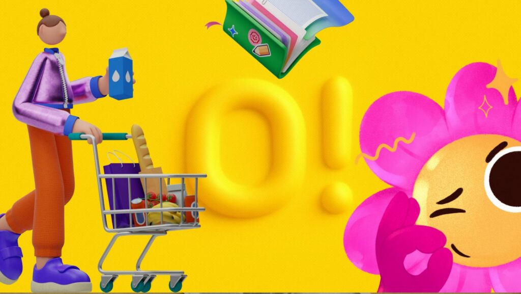
Picture a small team building a B2B analytics dashboard. They have strong developers but zero budget for a dedicated illustrator. They need a visual identity that feels trustworthy, not corporate or stiff.
The team selects “Business 3D” from the library. They start by downloading high-fidelity PNGs for the marketing landing page to explain complex data concepts. Since the style holds together, a 3D chart illustration sits next to a 3D character without visual friction.
Moving to the product UI brings up empty states-those awkward moments when a user has no data. Using the same style filter, they find illustrations for “no search results” and “server error.”
Paid plans unlock SVG versions. Now the frontend developer can tweak hex codes on the fly. Primary accents shift to match the product’s specific shade of blue. The result looks intentionally designed, not assembled from spare parts.
Scenario 2: The Content Marketing Engine
A marketing manager at a mid-sized fintech company needs to publish three blog posts a week plus a newsletter. Topics are abstract: inflation, crypto security, remote work culture.
Hiring a custom illustrator for every post creates a bottleneck. Instead, the manager uses Ouch’s Mega Creator integration. For a post about “remote security,” searching for a generic padlock photo won’t cut it.
They open the editor and select their brand’s chosen flat vector style. They search for a “laptop” object and a “shield” object separately. Ouch assets often come as layered, searchable components rather than just flattened scenes. The manager combines these elements into a new composition. A background blob from the “Web Elements” category frames the shot.
Fifteen minutes later, the post goes live. Imagery matches the company’s previous posts, maintaining visual continuity without bugging the design department.
A Typical Workflow: The Presentation Crunch
Ravi, a product designer, gets a 9:00 AM request from sales. The pitch deck needs to be finished by noon. Current slides are walls of text.
Ravi opens the Pichon desktop app, which syncs with the Ouch library. No browser tabs. No download folders. He keeps his presentation software on the left and Pichon on the right.
He needs a visual for a slide about “dormant accounts.” He searches for a metaphor. When designing an empty state for a ‘Do Not Disturb’ mode or an inactive user profile, you might search for sleeping clipart, but finding it in the exact same isometric style as your dashboard icons is usually a nightmare. Ouch fixes this. Ravi locks the search to “Woolly,” the style used on the previous slide.
A character napping on a cloud appears. He drags the vector directly onto his canvas. One issue: the character faces left, leading the eye off the slide. He opens the vector in Illustrator, flips the composition, and adjusts the cloud to a neutral gray.
By 10:30 AM, twelve slides are populated with consistent imagery. That drag-and-drop workflow removed file management friction, letting him focus purely on the narrative flow.
Comparing Ouch to the Market
Stock illustration is crowded, but tools generally fall into three buckets.
Freepik and Shutterstock: The heavyweights of volume. They have millions of assets. The downside is inconsistency. You might find a great server icon, but you will never find that exact same artist’s rendering of a shopping cart. You spend hours trying to match stroke weights and color palettes between contributors.
unDraw: A popular open-source option for startups. Free and allows for basic color customization. The limitation is ubiquity. Because it is free and decent, it is everywhere. Using unDraw signals “early-stage startup” immediately. Not the vibe a scaling company wants.
Ouch: The “system” approach sets it apart. It sits between the massive variety of Freepik and the singular aesthetic of unDraw. You get enough variety to avoid looking generic, but strict categorization builds a cohesive system.
Limitations and When This Tool is Not the Best Choice
Ouch covers a vast amount of ground, but it won’t replace every creative scenario.
Hyper-Specific Industrial Imagery: Building a website for a biotech firm? If you need anatomically correct diagrams of a proprietary heart valve, look elsewhere. Ouch excels at metaphors (growth, connection, error) and general categories. It cannot replace technical illustration.
Merchandise and Print on Demand: Standard licensing covers digital products and marketing. Slapping these designs on t-shirts for sale requires a different conversation. Check the terms before printing.
Mascot Ownership: Want a character you own exclusively? Think the Michelin Man or Duolingo Owl. Stock won’t work. You can use Ouch characters as UI mascots, but you don’t own the IP. Another brand could legally use the same face.
Practical Tips for Implementation
Treat the library like a toolkit rather than a gallery.
Recolor Ruthlessly: Never use default colors. Even if that blue looks nice, it is the same blue everyone else uses. Swap the palette to your brand hex codes. That single step makes stock look custom.
Use Lottie and Rive Files: Static images work, but Ouch provides animations for many styles. Drop a lightweight Lottie JSON file into a “loading” state. It adds a level of polish static PNGs cannot match.
Stick to One Style Family: Don’t cherry-pick the “best” image for each situation regardless of style. If you commit to “Line,” stay there. If you commit to “3D Business,” stay there. Consistency breeds trust in UI design.
Leverage the Objects: Stop looking for full scenes. Search for components. Build complex visuals in Mega Creator using parts (a desk, a plant, a person) rather than hoping a pre-made scene fits your exact requirements.
Ouch effectively answers the central question of branding with stock assets. You don’t need a custom illustrator to have a custom look; you just need a library that respects the rules of design systems.